Introduction: a small rectangle that moves markets
Did you know that much of Europe’s appliance and electronics aisle is governed by a single visual pattern: 7 stacked bars from green to red, a headline letter, a few icons, and a tiny QR code?

The purpose of that rectangle is to make differences legible so the market can do the rest. The EU’s energy and efficiency labels have been iterated for decades. They standardise the first impression and preserve the deep details, which is why they influence billions of euros of spend without shouting.
The headline claim of this essay is simple: if you build or regulate products, you can borrow this playbook. Clear choice architecture is market infrastructure that rewards genuine innovation and punishes noise.
What problem was the label trying to solve?
The original problem wasn’t just about electricity bills. Manufacturers spoke in incomparable dialects: watts here, kilowatt-hours there, a “quiet mode” on one box and “eco” on another, and almost no way to translate into lifetime cost. Retailers layered on their own copy. Even conscientious shoppers were counter-programmed by time pressure, complexity, and asymmetric information.
The EU’s answer was to harmonise the information surface. A standard scaffold would carry a universal, ordinal message at a glance (“A is better than B, B is better than C”, etc.) while the domain-specific details would remain close at hand for those who wanted them.
The result: faster, more confident comparisons on the shelf and online, with a verifiable audit trail behind a QR code.
The framework that encodes this philosophy today is Regulation (EU) 2017/1369, the legal spine for modern EU energy labelling and the EPREL database that powers those QR codes. [1]
A short history of a durable pattern
The story starts in the 1970s, when the Community experimented with appliance labelling (Directives 79/530/EEC and 79/531/EEC [2]). These were early, limited attempts to get comparable information onto products. In 1992, Directive 92/75/EEC [3] created a harmonised approach for household appliances, laying conceptual groundwork for the A–G spectrum that would become a household sight.
By 2010, Directive 2010/30/EU [4] widened scope from “appliances” to “energy-related products,” pushed toward pictograms (so labels could be language-agnostic), and—crucially—allowed extra top classes (A+, A++, A+++). Those extra classes worked until they didn’t. As manufacturers improved, the top of the scale became crowded. When everything looked “A++,” the label’s discriminating power faded.
Hence the 2017 reboot. Regulation (EU) 2017/1369 [1] replaced the 2010 directive, mandated a return to a simple A–G scale, reserved the top classes initially to keep headroom for innovation, and connected labels to a public product database (EPREL [5]) via a QR code. Consumers get a clean ordinal signal; regulators and power users get a verifiable trail of test data and declarations. The first rescaled labels went live on 2021-03-01 for refrigerators/freezers, dishwashers, washing machines/washer-dryers, and electronic displays; light sources followed on 2021-09-01.

The family has since continued to evolve. Electronic displays have their own delegated regulation (2019/2013 [6]) that adapts the common grammar to screens. Tyres use a separate but visually related scheme (Regulation (EU) 2020/740 [11]), which adds safety and noise cues. And the newest member, “smartphones and tablets,” adopts the familiar scaffold while introducing icons for battery endurance, durability and software updates (2023/1669 [7], applicable 2025-06-20).
A tour of the visual grammar
The label looks simple because it hides complexity behind a few carefully chosen redundancies. [9]
Start with the A–G ladder. This is an ordinal scale and does not refer to absolute measurements or specific units. A washing machine and a television can both be “B,” but the underlying metrics and thresholds are product-specific and defined in their delegated acts. This helps consumers compare within a category while avoiding false precision across categories. The law encodes those mappings using an Energy Efficiency Index (EEI) per product family; the public sees a letter, the engineers see the function. [6]
Layer on the green-to-red ramp. Humans read colour pre-attentively; we understand “better” and “worse” in a glance before we parse numbers. The ramp accelerates ranking, while the letter grade provides redundant coding for accessibility and for contexts where colour reproduction is poor (catalogue black-and-white, small thumbnails). The framework specifies a monochrome rendering for precisely that reason. [1]
Add the headline class block (the big A/B/C) and you get a fast first impression. That impression is constrained by a discipline the EU calls rescaling: over time, as products improve, the Commission can tighten the thresholds so that today’s “A” becomes tomorrow’s “C” without accusing anyone of backsliding. Consumers keep a stable mental model; innovators keep room to differentiate. The return to plain A–G in 2017, with the top bands intentionally hard to reach at first, was the policy expression of that discipline.
Beneath the ladder live the pictograms. This is where the system earns its keep. The scaffold stays the same; the lexicon changes with the domain. A dishwasher’s label shows water per cycle and noise; a display’s label includes on-mode power and screen area; the phone/tablet label brings in battery endurance, repairability, and software support in addition to energy. The icons are formalised in annexes so they remain recognisable and legally tight, and they are chosen to be language-neutral. [6]
Finally, the QR code anchors the entire performance. Point a camera and you land on the product’s EPREL record—declared data, test results, and the “product information sheet” that gives auditors and buyers depth on demand. The label is the front door; EPREL is the house.
A deep-dive example: phones and tablets
Smartphones and tablets are a hard test for any labelling system. Energy use matters, but so does battery life, durability under drops and water, and software longevity, all of which drive total cost of ownership and premature replacement.
The 2023 delegated regulation for phones and tablets keeps the familiar headline (A-G) and then composes a richer story through product-specific cues. The label’s anatomy is recognisable (ladder, top-letter, QR), yet the meaning expands: an endurance metric based on standardised tests, durability indicators, and a repairability/updates signal.
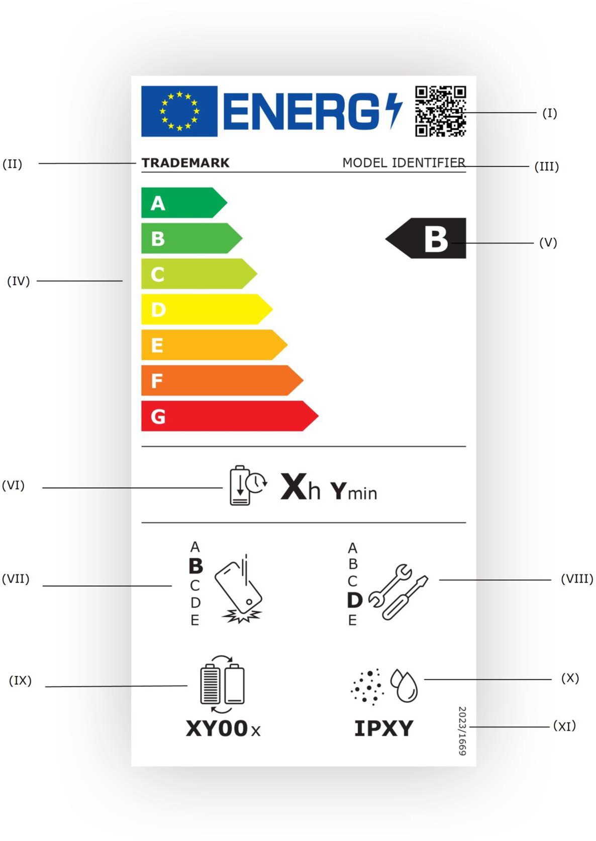
This is the EU applying a consistent choice architecture to a category where “spec sheet optimisation” can hide lifecycle drawbacks. The regulation entered into application on 2025-06-20. [7]
Why this design works (and where to be skeptical)
The design works because it does not ask the first impression to carry the last mile of analysis: the letter and colour ramp get you oriented, the icons describe the key trade-offs, and the QR opens the source.
Behaviourally, people can rank options more quickly when an ordinal signal is stable and ubiquitous; legally, the signal is backed by auditing and market surveillance.
The result is a virtuous loop: when high-efficiency products are easier to recognise, they sell; when they sell, firms invest; when they invest, the scale can be rescaled to keep headroom.
The Commission’s 2021 roll-out was exactly that: a reset to restore discriminating power after a decade of A+/A++/A+++ creep. [8] [10]
Three cautions will help you use the pattern responsibly.
First, remember category relativity. An “A” display and an “A” heat pump are not commensurate. The public copy should avoid implying cross-category comparability; the governance should keep thresholds and test methods visible in EPREL. The law already treats them separately via delegated acts (for example, 2019/2013 for electronic displays). [6]
Second, watch out for single-figure bias. The big letter can overshadow critical secondary attributes (water use, noise, durability). This is why the pictogram set matters, why the data sheet exists, and why online listings use a compact arrow that can expand to a full label and then to the datasheet—progressive disclosure by design. (Those arrow-only visuals for ads and e-commerce are specified in the annexes to each delegated act.)
Third, treat accessibility as a requirement. Colour-blind readers and grayscale printouts should still communicate meaning with the letter, the ordering of the bars, and the iconography. The legal artwork files and annexes define monochrome fallbacks and minimum sizes for precisely this reason. [1]
One family, several branches
There is a temptation to talk about “the EU label” as if it were a single monolith. It’s better to think in families.
The energy-related product family sits under Regulation (EU) 2017/1369 [13] and product-specific delegated acts. That’s where you find white goods, displays, and now phones and tablets. The rescaled labels from 2021-03-01 covered refrigerators/freezers, washing machines/washer-dryers, dishwashers and electronic displays; light sources switched on 2021-09-01. [8]
Tyres are their own branch. The label looks familiar—efficiency, wet grip, noise, and a QR link—but the legal home is Regulation (EU) 2020/740 [11], which also amends the 2017 framework. Its application date was 2021-05-01. The design lesson is that the grammar is portable: a stable scaffold can host a different set of risk and performance signals.
Buildings are a separate universe again. Energy Performance Certificates (EPCs) also run A–G visuals, but they live under the Energy Performance of Buildings Directive [12] rather than the product-labelling framework. The shared alphabet does not imply shared physics; it’s a reminder to be precise about scopes when you borrow design patterns across domains.

What you can take from a label in your projets
If you own a product line or a marketplace, the EU label offers a practical way to think about choice architecture that respects both your customer and your P&L.
The first executive lesson is about conversion and trust. A stable, familiar first-impression language reduces friction. Shoppers who are less overwhelmed are more decisive, and decisiveness converts. This isn’t just a retail trick; it’s a contract with the buyer that you will not waste their time making incomparable claims. The EU’s approach works because the simple signal is backed: a QR code that doesn’t resolve to verifiable data would corrode trust.
The second lesson is about innovation incentives. A scale that resets as the market improves is a gift to R&D and product marketing. It keeps the top band scarce without moving the goalposts mid-season for a single manufacturer. Everyone knows the rules; the Commission announces rescaling; the market adapts; and the signal regains clarity. It’s a system designed to avoid “A++++” inflation.
The third is about operational governance. Standardising a scaffold does not mean freezing a category. The EU couples the scaffold to domain-specific lexicons via delegated acts, which can add, retire, or refine icons and metrics. That’s how displays got different power metrics than dishwashers, and how phones picked up durability and updates. This makes it a living standard.
Translating the playbook to your own domain
Suppose you run a marketplace for connected devices, or you manage a portfolio of hardware SKUs, or you are building procurement guidelines for an enterprise fleet. You can adapt the EU’s pattern without copying the legalese.
- Begin by defining the ladder. Pick an ordinal scale that compresses the decision honestly—A through G, or 1 through 7—and be explicit that the scale is category-relative. If you expect rapid improvement, reserve the top band for future entrants and set rescaling triggers. Echo the EU’s discipline: keep headroom, signal changes early, and document the mapping from raw metrics to bands.
- Create a stable scaffold that never changes across your catalogue: a header, a headline grade, a small set of secondary icons, and a link to a canonical, permanent data sheet or API record. Put as much of the semantics into icons as you can, but don’t let the icons float; publish a legend once, and keep it versioned. The EU’s annexes do this job for each category; you can maintain an internal “annex” in your docs or design system.
- Design for progressive disclosure. The shelf or search results page gets the headline arrow and the letter; the product page gets the full label; the “learn more” link lands on the canonical record. Don’t force everyone to drink from the hydrant; make it easy for power users to go deep. This pattern is why the EU’s labels work offline and online; the artwork for compact arrows in ads and listings is specified precisely to allow that step-up flow.
- Plan for governance. The EU publishes delegated acts, runs consultations, and sets enforcement and market surveillance expectations. You need your internal equivalents: who can add or retire icons; when the thresholds move; what happens to legacy assets; how your analytics team will measure time-to-choice, error rates, and buyer satisfaction before and after a rescale.
A final note on risk: labels can mislead when they stray from their lane. Don’t hint that cross-category grades are comparable. Don’t let colour do all the work without redundant coding. And don’t allow an “A” to become a marketing shield against meaningful trade-offs that the icons should surface. The whole promise depends on the ratio of signal to spin.
Summary: a small design that keeps markets honest
The EU’s label is an argument about the social contract of markets. Let sellers compete, but require them to speak a common language at the point of decision.
If you reuse this concept, provide a fast, legible signal and an honest path to the underlying data. Keep the top of the scale scarce so improvement remains visible. Rescale when the market changes. Expand the lexicon when the physics demands it.
In an era where product pages sprawl and specmanship can bury the lede, that’s an approach worth copying. If your customers struggle to compare options without a spreadsheet, the problem is not their attention span; it’s your information surface. The EU shows that a little standardisation, done with care, can make a market smarter—without making it smaller.
References and pointers for further reading
- Framework and QR/EPREL: Regulation (EU) 2017/1369 [1] [13] [9] setting the framework for energy labelling and establishing EPREL. The recitals explain the logic: informed choice, innovation incentives, rescaling discipline, and public data access.
- Rescaled labels rollout 2021: Commission press materials announcing the March 2021 switch for four categories and the September 2021 switch for light sources. [8]
- Electronic displays: Delegated Regulation 2019/2013 [6], which adapts the common scaffold to screens and defines the ad/listing arrow artwork.
- Tyre labels: Regulation 2020/740 [11], a sibling scheme with safety and noise cues, applicable May 2021.
- Phones and tablets: Delegated Regulation 2023/1669 [7], with application from June 2025 and a label that extends the lexicon to endurance, durability and updates while keeping the A–G scaffold.
- Buildings: EPC, A separate framework. [12]
- Origins and evolution: Early directives 79/530/EEC [2], 79/531/EEC and 92/75/EEC [3], and the 2010/30/EU [4] recast; the lineage that led to today’s framework.
| [1] | (1, 2, 3, 4, 5) https://eur-lex.europa.eu/legal-content/EN/TXT/PDF/?uri=CELEX%3A32017R1369 “EU 2017/1369 - EN - EUR-Lex - European Union” |
| [2] | (1, 2) https://eur-lex.europa.eu/eli/dir/1979/530/oj/eng “Directive - 79/530 - EN - EUR-Lex” |
| [3] | (1, 2) https://eur-lex.europa.eu/eli/dir/1992/75/oj/eng “Directive - 92/75 - EN - EUR-Lex” |
| [4] | (1, 2) https://eur-lex.europa.eu/eli/dir/2010/30/oj/eng “Directive - 2010/30 - EN - EUR-Lex - European Union” |
| [5] | https://eprel.ec.europa.eu/screen/home “European Product Register for Energy Labeling” |
| [6] | (1, 2, 3, 4, 5) https://eur-lex.europa.eu/eli/reg_del/2019/2013/oj/eng “Delegated regulation - 2019/2013 - EN - EUR-Lex” |
| [7] | (1, 2, 3) https://eur-lex.europa.eu/eli/reg_del/2023/1669/oj/eng “Delegated regulation - 2023/1669 - EN - EUR-Lex” |
| [8] | (1, 2, 3) https://ec.europa.eu/commission/presscorner/detail/en/ip_21_818 “New EU energy labels applicable from 1 March 2021” |
| [9] | (1, 2, 3) https://energy-efficient-products.ec.europa.eu/ecodesign-and-energy-label/understanding-energy-label_en “Understanding the Energy Label” |
| [10] | https://commission.europa.eu/news-and-media/news/focus-new-generation-eu-energy-labels-2020-08-13_en “In focus: A new generation of EU energy labels” |
| [11] | (1, 2, 3) https://eur-lex.europa.eu/eli/reg/2020/740/oj/eng “Regulation - 2020/740 - EN - EUR-Lex - European Union” |
| [12] | (1, 2) https://energy.ec.europa.eu/topics/energy-efficiency/energy-performance-buildings/energy-performance-buildings-directive_en “Energy Performance of Buildings Directive” |
| [13] | (1, 2) https://eur-lex.europa.eu/eli/reg/2017/1369/oj/eng “Regulation - 2017/1369 - EN - EUR-Lex” |
 is an entrepreneur who occasionally publishes field notes on systems, leadership, and the messy edge between technology and people.
Comments
Interested to discuss? Leave your comments below.